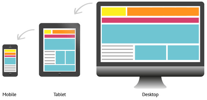
Responsive web design is an approach whereby a designer creates a web page that “responds to” or resizes itself depending on the type of device it is being seen through.
That could be an oversized desktop computer monitor, a laptop or devices with small screens such as smartphones and tablets.
Responsive site design means the flexibility of the website's graphic structure. In other words, designing and programming the site in such a way that the page loads at different height and widths, the site will run at a reasonable speed without deleting the necessary information, which does not mean that non-responsive sites on the tablet Phones and smartphones are not loaded but they are not intelligently controlled.
Responsive Web design has become an essential tool for anyone with a digital presence. With the growth of smartphones, tablets and other mobile computing devices, more people are using smaller-screens to view web pages.
As just announced by Google in 2018, websites have to also consider the mobile-first index. As more small businesses increase their mobile presence from 2013, their website, e-Commerce, Google Business page, social media pages and other assets have to be easily accessible across all devices.
Responsive web site design has a few steps ahead of conventional sites and various templates need to be designed and formatted to fit thematically.
They fall. If the site design covers more dimensions of smartphones, more audiences can use that website.